I recently started on a new project, and while sculpting with my boss and colleagues we discussed how we feel when starting a piece of work. I was quite relieved to hear that my boss felt the same way I do when starting a new sculpt – a little bit afraid.
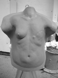
This mastectmy appliance sculpt was for a TV drama called The Walk. It had to be realistic and subtle, despite being a dramatic effect. (For Neill Gorton/Millennium FX)
I suppose it is that ‘blank canvas’ syndrome. That is, when until something starts to take real shape, it is perfectly possible that whatever ability you had before had somehow left your brain and now you were just pushing a lump of mud around and hoping for the best.
I thought it worthwhile to share that as I was surprised and happy to hear that my talented boss felt the same way when all that is staring back at you is a blank armature and you are the only thing turning a big bag of mud into something that people want to pay you for!
I also get the same feeling just before I apply a prosthetic to someone for the first time. Once it is on, and the colour starts working its magic, I breath a silent sigh or relief. Very often, I apply something only once or twice, but when a makeup requires more applications, I get better each time and the nerves diminish. It certainly keeps me on my toes.
It is something I point out in workshops I teach, as the feeling is especially acute when there is an audience. I usually stick a makeup on some poor soul in the wee hours and there is none present but those involved. In a live class, there is the added pressure of a whole team of expectant eyes awaiting the process to unfold before them. When I start a demonstration, I like to remind people that they should rejoice at how rough it looks at first before it takes real shape. Theirs is likely to also, but look what happens as you gradually pull it all together.
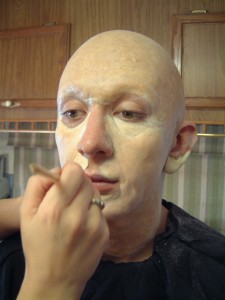
Foam latex appliances gradually come together as the colours are layered. It never stops being a little bit scary to do! (for David White/Altered States FX)
This is important, because when sculpting anything, it gradually takes shape and the first part is when it looks it’s worst. If you have never really sculpted anything, you will meet this phase first and it can put you off if you are not encouraged to push through and ‘find’ the shapes.
It is the same with makeup demos – I tell people to rejoice in how crap something looks at first, because this is what they will see when they try. Gradually, however, it comes together and you acquire the faith to trust in your ability and it soon becomes a process.
You agonise at first with the artistic part, then gradually it becomes a craft and you execute trusted refining and texturing techniques. I love it – I think few people lose the fear entirely! Let’s see what tomorrow brings.
-Stuart

