Podcast #9 – Symmetry, Schools & Fools
Or on iTunes Here!
Whilst teaching a class recently, a student was hung up on getting the nose perfectly symmetrical.
I explained as I often do that the human face isn’t symmetrical, so going for complete mirror image reflection necessary.
That being said, asymmetry owing to sloppy work isn’t good either – the fact that there is little perfect symmetry in nature doesn’t let you off the hook!
It’s handy to keep a small mirror for the purpose of seeing how the reflection compares with reality. Holding the mirror in the centre and seeing how the reflected sides look, bobbing your head back and forth to compare with your sculpt can clue you into what needs correcting.
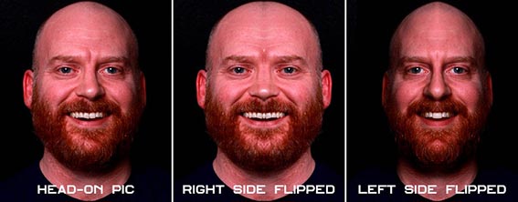
Now I remember seeing the left and right sides of a face reflected in a photograph to demonstrate the asymmetry in a normal face, and more importantly, how odd perfect symmetry actually looks. It seemed like a worthy point to revisit here.
Looking at the pictures below, you can see how the face appears normally, and then with the left side reflected, and the right side reflected. The moral of this story is try to keep forms balanced but don’t get hung up on perfect symmetry – unless of course your particular project requires it!
I helped sculpt a suit for a Marvel movie a couple of years ago, and one thing we had which helped was a builders laser line. Kind of like a spirit level, but instead of being a long piece of metal with a bubble in the centre, it throws out a straight level laser line which helps you keep some symmetry.
I remember at college sculpting a full size head and a full size figure from life and using a plumb line – basically a piece of string with a lead weight on the end to keep a straight line. That helps you keep on target with the centre line, and you can use callipers to measure and plot common points to sketch out boundaries like where the eye corners start and finish, where the mouth is in relation to the nose etc.
This sounds like a video to be honest – again comment, write and let us know what you think.
UMAE 2016
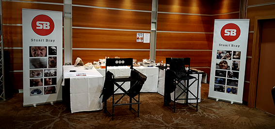
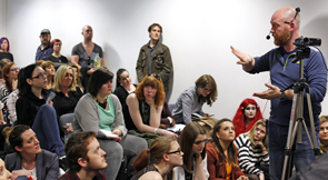
The UMAe stand for United Makeup Artists expo. It is a smaller UK trade show, but perfectly formed. I had a great time but it was exhausting. There were loads of demos going on all day, and this year I had my own stand, spoke to a lot of people, did a demo makeup and a presentation on the stage for blood rig effects.
I wanted to do a thing on blood rigs as I have done quite a few for shows over the years, but Non Disclosure Agreements mean I can’t show anything we did on most of them. I decided to do a demo of my own so I could show the process from start to finish without upsetting production.
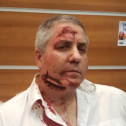
Paul Ewen sporting my bleeding neck appliance
I had a couple of cool people helping me out too – Alice Pinney and Jess Heath who applied loads of pieces I made, so thanks for the help guys. You worked hard!
Also thanks to Leanne Hicks who helped me out loads as well as patiently modelling for my makeup demo, a creepy kind of stern looking businesswoman was the idea, but it kind of ended up looking like an evil politician. I called her Angular Merkel, but we settled on The Wicked Which of the Westminster.
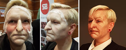
Leanne Hicks wore a character makeup, which we ended up christening ‘The Wicked Witch of the Westminster’…
The show had a nice feel to it – you can actually go up to the people and speak to them. There isn’t a stadium sized crowd to navigate so it’s not a huge task to speak to the people you want to talk to.
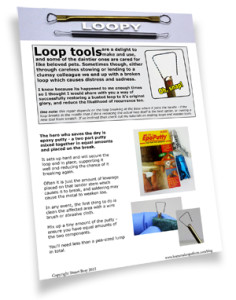
Said hey to Richard Redlefsen, and I gave him a few sculpting tools I had made which was a nice touch – I made a bunch of tools for a makeup school called The Iver based at Pinewood for which I did a class at the week before. I knew he would be at the show so I made a few extra, and I got a kick out of giving them to him – nice guy and very talented makeup artist. He did a cool Phantom of the Opera makeup, and it was pretty damn cool.
Also Dan Gilbert was demoing for PPI, and I needed some PAX. He dashed up to his room to grab me some which he had, which I thought was rather dashing of him so thank you for that Dan. A true gent!
Folios
Whilst at UMAE last week, I got to speaking with a lot of people starting out who wanted me to take a look at their folios. I like to talk people through what I see, and I know that when I was starting out that I really appreciated good advice from people that took the time to look through my stuff.
Shows like this are good but they can be intense, with groups of people all descending at once when they notice a folio show. There were some good pieces and I will be straight with people regarding the work, and although there are many approaches to folio layout, there are a few solid consistent aspects to a folio that I think remain regardless.
1. Good clear and large images
With digital cameras, there’s little excuse for blurry or badly exposed images. If images are taken on set where there is low level light, it’s fair enough that on occasion the pics would be less than perfect, but if you are responsible for building something, there is plenty of opportunity to take good clear images.
Opt for professional prints – online print developers like Snapfish and Photobox for example will send you great 10×8’s (A4 ish) sized photos. You may have a great printer but often this works out more expensive than buying prints, and they rarely weather well over time.
2. Not too many and not too long
Viewer fatigue is not the intended result of an extensive folio, but I think it’s fair to say that after a while, your brain can’t take in new things with equal enthusiasm.
If you have extensively documented the manufacture process of something, you need to edit that down to a few choice images unless there is a specific reason to dwell on that aspect. It may be worth keeping your main ‘general’ folio streamlined with a few selected images from each project, and then keep to hand additional more in-depth folios which drill deeper into things should that be necessary.
3. Easy to handle
If a folio keeps dropping leaves or sheets slide around or can’t fold over easy then it becomes a bit of a chore to handle. Make sure you handle a folio and turn the pages yourself before committing to buy. If it annoys you to handle, then chances are it will annoy others too.
It’s a tragedy for your good work to not be noticed as the viewer is tasked with wrangling the sleeves or relocating misaligned punched holes.
Makeup Schools – An Observation
There are some things I noticed about work I saw from makeup schools, and I think it needs bringing up. Essentially, I saw work from someone who had travelled to LA from the UK to attend a makeup school for some months.
There were pictures of work in there which seemed both extensive in size but poor in quality. Now I know students are by definition learning, and there is going to be mixed ability but there seems to be an irresponsible approach when allowing large scale sculpting to take place when there are some fundamental areas which need addressing.
Simply put, if you attend a makeup school with the intention of learning how to create makeup effects using prosthetics, I think you are being done a disservice if you can’t sculpt a face well. If the anatomy is wrong, then that needs fixing. I don’t think it’s good enough to be encouraged to create extensive gore or over the top creatures if in doing so you don’t display a mastery of basic form and anatomy.
If you can sculpt a face with a reasonable degree of accuracy and skill then It’s okay to move onto character and costume areas. However, if your sculpts clearly display that you don’t know your way around a face, then what the hell are you doing spending huge amounts of time sculpting costume or armour details?
Rendering anatomy is pretty much the most fundamental skill in sculpting, and I liken it to doing an impersonation of somebody. If you do a bad impression of someone for the entertainment of somebody else, and they haven’t actually seen that person before so can’t vouch for how accurate a representation it is, they may laugh and be entertained by it. But if someone who know that person well overheard it, they’d be thinking you did a crap impression, that you were way off the mark, and that you’ve seen it done better.
Sculpting anatomy is like that, it’s not a matter of opinion. It’s right or it’s wrong. There are naturally variations and style choices which people make to create character, but those are within believable tolerances. Just sculpting badly because you don’t know any better isn’t the same thing.
My guess is that this happens when the teachers don’t know how to teach you or how to keep you focussed on what matters. I’m not saying that sculpting hard edge model-making features and costume isn’t a skill – of course it is. But that’s not makeup school, and if you’re being encouraged or permitted to avoid grasping the nettle of creating anatomy then you’ve seriously got to question your schools motives. Do they want you to learn right or do they just want your money?
Makeup schools are a business so it’s only right they charge for their service, but I have heard and seen many examples of people who travelled far and spent a lot and when you see what they have taken away from it then you wonder if it is a fair exchange.
As with any business, there are some sharp practitioners and some outstanding examples. I think it would be a good idea to run this checklist over when considering a makeup school.
1. Check who the tutors are.
2. Look at previous students work.
3. Speak to previous students.
4. Is there a screening process or do they take anyone who can pay?
Insane Methods For Face Casts
We’ve all heard of the anecdotal face casts that went hideously wrong – the result of phenomenally terrible practice on the part of people doing it. Things like using bare plaster all over the face, bears and eyebrows becoming stuck or undercuts locking heads – it’s common sense mostly but that is not as common as you’d imagine.
Anyhow, check out these howlers, and if you know of any outrageous lfecasting videos which are not here, please do get in touch and send us a link so we can share it! Let’s show everyone how NOT to do it!
https://vimeo.com/21710023
https://www.youtube.com/watch?v=sVUHlDou6cQ&feature=youtu.be&app=desktop
https://www.youtube.com/watch?v=09rUbu33Z1E
http://www.liveleak.com/view?i=077_1462827743
http://www.telegraph.co.uk/news/uknews/law-and-order/6311398/Schoolgirl-16-lost-eight-fingers-in-plaster-of-Paris-accident-during-art-lesson.html
Incidentally, this video collaboration I did with Klaire de Lys a few years back shows a way to lifecast safely without taking insane risks: https://www.youtube.com/watch?v=2NyF5bKlkT0
Stay creative!
Stuart & Todd

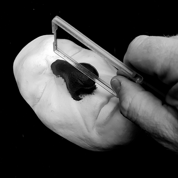
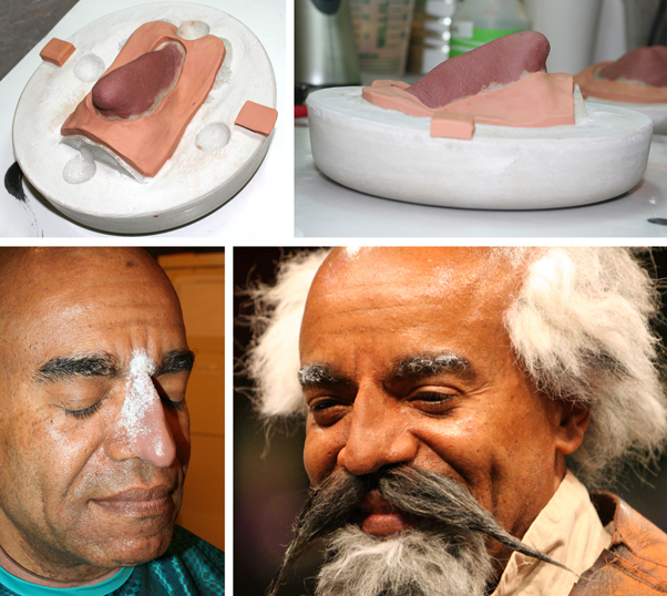
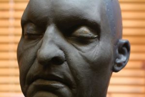 Sometimes appliances can be simple individual appliances.




 This was the presentation I did at the 2015 UMAExpo in London this April, so I have reworked it and added some extra things as I think it would be a helpful resource for fellow travellers on the skin-tone matching journey.